Greetings, curious Grade 6 students! Today, we’re embarking on an exciting journey into the world of data visualization. Imagine your data as colorful puzzle pieces waiting to be assembled into meaningful patterns. By the end of this blog post, you’ll be able to select the perfect table or graph to showcase your data effectively. Let’s dive in and uncover the secrets of data representation!
Why Use Tables and Graphs?
Before we dive into the magic of data visualization, let’s understand why we use tables and graphs. Data comes in various forms, and tables and graphs offer simple, visual ways to organize and present information. Tables are perfect for neatly arranging data, while graphs visually show trends and patterns, making data interpretation a breeze!
Selecting the Right Table:
- Frequency Tables: Frequency tables count the occurrences of different data points, making them ideal for displaying survey results or tallying votes in an election.
- Comparative Tables: Comparative tables compare different sets of data side by side, allowing us to draw comparisons, like comparing the heights of students from different classes.
- Simple Tables: Simple tables list data in rows and columns, organizing information without any specific calculations.
Choosing the Perfect Graph:

Bar Graphs:
Bar graphs are fantastic for comparing discrete categories, like displaying the number of books read by different students.
Line Graphs:
Line graphs show trends over time, making them perfect for displaying changes in rainfall or temperature over the months.

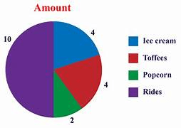
Pie Charts:
Pie charts display parts of a whole, like showing the percentage of students who like different subjects.
Discussing Appropriate Uses:
Now that we’ve explored various tables and graphs let’s discuss their appropriate uses:
- Analyzing Trends: When you want to show how data changes over time or with different conditions, line graphs are your go-to!
- Comparing Categories: For comparing data that falls into categories, bar graphs and pie charts work wonders!
- Presenting Raw Data: When you have straightforward data without the need for calculations, simple tables do the trick!
Congratulations, Grade 6 data enthusiasts! You’ve learned how to select the perfect tables and graphs to bring your data to life. Remember, data visualization is like telling a story with numbers. By choosing the right method, you can make your data clear and engaging for your audience!
As you continue your data visualization journey, practice experimenting with different tables and graphs. Get creative, and let your data speak through visuals! Soon, you’ll be a master at unlocking insights and presenting data like a pro.
Happy data visualization adventures!
Please see related topic:
Unraveling Data Secrets: Becoming a Master Detective of Patterns and Trends
Data Detective: Unraveling Mysteries Through Exciting Methods
Data Detective Adventure: Unlocking Insights with Stem and Leaf Plots
Data Detective Challenge: Unraveling Mysteries through Graphs and Diagrams!

3 thoughts on “Data Visualization Made Simple: Choosing the Right Tables and Graphs”